Statistical Errors in the Medical Literature
- Misinterpretation of P-values and Main Study Results
- Dichotomania
- Problems With Change Scores
- Improper Subgrouping
- Serial Data and Response Trajectories
- Cluster Analysis
As Doug Altman famously wrote in his Scandal of Poor Medical Research in BMJ in 1994, the quality of how statistical principles and analysis methods are applied in medical research is quite poor. According to Doug and to many others such as Richard Smith, the problems have only gotten worse. The purpose of this blog article is to contain a running list of new papers in major medical journals that are statistically problematic, based on my random encounters with the literature.
One of the most pervasive problems in the medical literature (and in other subject areas) is misuse and misinterpretation of p-values as detailed here and here, and chief among these issues is perhaps the absence of evidence is not evidence of absence error written about so clearly by Altman and Bland. The following thought will likely rattle many biomedical researchers but I’ve concluded that most of the gross misinterpretation of large p-values by falsely inferring that a treatment is not effective is caused by (1) the investigators not being brave enough to conclude “We haven’t learned anything from this study”, i.e., they feel compelled to believe that their investments of time and money must be worth something, (2) journals accepting such papers without demanding a proper statistical interpretation in the conclusion. One example of proper wording would be “This study rules out, with 0.95 confidence, a reduction in the odds of death that is more than by a factor of 2.” Ronald Fisher, when asked how to interpret a large p-value, said “Get more data.” Adoption of Bayesian methods would solve many problems including this one. Whether a p-value is small or large a Bayesian can compute the posterior probability of similarity of outcomes of two treatments (e.g., Prob(0.85 < odds ratio < 1/0.85)), and the researcher will often find that this probability is not large enough to draw a conclusion of similarity. On the other hand, what if even under a skeptical prior distribution the Bayesian posterior probability of efficacy were 0.8 in a “negative” trial? Would you choose for yourself the standard therapy when it had a 0.2 chance of being better than the new drug? [Note: I am not talking here about regulatory decisions.] Imagine a Bayesian world where it is standard to report the results for the primary endpoint using language such as:
- The probability of any efficacy is 0.94 (so the probability of non-efficacy is 0.06).
- The probability of efficacy greater than a factor of 1.2 is 0.78 (odds ratio < 1/1.2).
- The probability of similarity to within a factor of 1.2 is 0.3.
- The probability that the true odds ratio is between [0.6, 0.99] is 0.95 (credible interval; doesn’t use the long-run tendency of confidence intervals to include the true value for 0.95 of confidence intervals computed).
In a so-called “negative” trial we frequently see the phrase “treatment B was not significantly different from treatment A” without thinking out how little information that carries. Was the power really adequate? Is the author talking about an observed statistic (probably yes) or the true unknown treatment effect? Why should we care more about statistical significance than clinical significance? The phrase “was not significantly different” seems to be a way to avoid the real issues of interpretation of large p-values. Since my #1 area of study is statistical modeling, especially predictive modeling, I pay a lot of attention to model development and model validation as done in the medical literature, and I routinely encounter published papers where the authors do not have basic understanding of the statistical principles involved. This seems to be especially true when a statistician is not among the paper’s authors. I’ll be commenting on papers in which I encounter statistical modeling, validation, or interpretation problems.
Misinterpretation of P-values and of Main Study Results
One of the most problematic examples I’ve seen is in the March 2017 paper Levosimendan in Patients with Left Ventricular Dysfunction Undergoing Cardiac Surgery by Rajenda Mehta in the New England Journal of Medicine. The study was designed to detect a miracle - a 35% relative odds reduction with drug compared to placebo, and used a power requirement of only 0.8 (type II error a whopping 0.2). [The study also used some questionable alpha-spending that Bayesians would find quite odd.] For the primary endpoint, the adjusted odds ratio was 1.00 with 0.99 confidence interval [0.66, 1.54] and p=0.98. Yet the authors concluded “Levosimendan was not associated with a rate of the composite of death, renal-replacement therapy, perioperative myocardial infarction, or use of a mechanical cardiac assist device that was lower than the rate with placebo among high-risk patients undergoing cardiac surgery with the use of cardiopulmonary bypass.” Their own data are consistent with a 34% reduction (as well as a 54% increase)! Almost nothing was learned from this underpowered study. It may have been too disconcerting for the authors and the journal editor to have written “We were only able to rule out a massive benefit of drug.” [Note: two treatments can have agreement in outcome probabilities by chance just as they can have differences by chance.] It would be interesting to see the Bayesian posterior probability that the true unknown odds ratio is in [0.85, 1/0.85]. The primary endpoint is the union of death, dialysis, MI, or use of a cardiac assist device. This counts these four endpoints as equally bad. An ordinal response variable would have yielded more statistical information/precision and perhaps increased power. And instead of dealing with multiplicity issues and alpha-spending, the multiple endpoints could have been dealt with more elegantly with a Bayesian analysis. For example, one could easily compute the joint probability that the odds ratio for the primary endpoint is less than 0.8 and the odds ratio for the secondary endpoint is less than 1 [the secondary endpoint was death or assist device and and is harder to demonstrate because of its lower incidence, and is perhaps more of a “hard endpoint”]. In the Bayesian world of forward directly relevant probabilities there is no need to consider multiplicity. There is only a need to state the assertions for which one wants to compute current probabilities.
The paper also contains inappropriate assessments of interactions with treatment using subgroup analysis with arbitrary cutpoints on continuous baseline variables and failure to adjust for other main effects when doing the subgroup analysis.
This paper had a fine statistician as a co-author. I can only conclude that the pressure to avoid disappointment with a conclusion of spending a lot of money with little to show for it was in play. Why was such an underpowered study launched? Why do researchers attempt “hail Mary passes”? Is a study that is likely to be futile fully ethical? Do medical journals allow this to happen because of some vested interest?
Similar Examples
Perhaps the above example is no worse than many. Examples of “absence of evidence” misinterpretations abound. Consider the JAMA paper by Kawazoe et al published 2017-04-04. They concluded that “Mortality at 28 days was not significantly different in the dexmedetomidine group vs the control group (19 patients [22.8%] vs 28 patients [30.8%]; hazard ratio, 0.69; 95% CI, 0.38-1.22;P >= .20).” The point estimate was a reduction in hazard of death by 31% and the data are consistent with the reduction being as large as 62%! Or look at this 2017-03-21 JAMA article in which the authors concluded “Among healthy postmenopausal older women with a mean baseline serum 25-hydroxyvitamin D level of 32.8 ng/mL, supplementation with vitamin D3 and calcium compared with placebo did not result in a significantly lower risk of all-type cancer at 4 years.” even though the observed hazard ratio was 0.7, with lower confidence limit of a whopping 53% reduction in the incidence of cancer. And the 0.7 was an unadjusted hazard ratio; the hazard ratio could well have been more impressive had covariate adjustment been used to account for outcome heterogeneity within each treatment arm.
An incredibly high-profile paper published online 2017-11-02 in The Lancet demonstrates a lack of understanding of some statistical issues. In Percutaneous coronary intervention in stable angina (ORBITA): a double-blind, randomised controlled trial by Rasha Al-Lamee et al, the authors (or was it the journal editor?) boldly claimed “In patients with medically treated angina and severe coronary stenosis, PCI did not increase exercise time by more than the effect of a placebo procedure.” The authors are to be congratulated on using a rigorous sham control, but the authors, reviewers, and editor allowed a classic absence of evidence is not evidence of absence error to be made in attempting to interpret p=0.2 for the primary analysis of exercise time in this small (n=200) RCT. In doing so they ignored the useful (but flawed; see below) 0.95 confidence interval of this effect of [-8.9, 42] seconds of exercise time increase for PCI. Thus their data are consistent with a 42 second increase in exercise time by real PCI. It is also important to note that the authors fell into the change from baseline trap by disrespecting their own parallel group design. They should have asked the covariate-adjusted question: For two patients starting with the same exercise capacity, one assigned PCI and one assigned PCI sham, what is the average difference in follow-up exercise time?
But there are other ways to view this study. Sham studies are difficult to fund and difficult to recruit large number of patients. Criticizing the interpretation of the statistical analysis fails to recognize the value of the study. One value is the study’s ruling out an exercise time improvement greater than 42s (with 0.95 confidence). If, as several cardiologists have told me, 42s is not very meaningful to the patient, then the study is definitive and clinically relevant. I just wish that authors and especially editors would use exactly correct language in abstracts of articles. For this trial, suitable language would have been along these lines: The study did not find evidence against the null hypothesis of no change in exercise time (p=0.2), but was able to (with 0.95 confidence) rule out an effect larger than 42s. A Bayesian analysis would have been even more clinically useful. For example, one might find that the posterior probability that the increase in exercise time with PCI is less than 20s is 0.97. And our infatuation with 2-tailed p-values comes into play here. A Bayesian posterior probability of any improvement might be around 0.88, far more “positive” than what someone who misunderstands p-values would conclude from an “insignificant” p-value. Other thoughts concerning the ORBITA trial may be found here.
Miguel Hernan has compiled an excellent set of examples on Twitter.
Dichotomania
Dichotomania, as discussed by Stephen Senn, is a very prevalent problem in medical and epidemiologic research. Categorization of continuous variables for analysis is inefficient at best and misleading and arbitrary at worst. This JAMA paper by VISION study investigators “Association of Postoperative High-Sensitivity Troponin Levels With Myocardial Injury and 30-Day Mortality Among Patients Undergoing Noncardiac Surgery” is an excellent example of bad statistical practice that limits the amount of information provided by the study. The authors categorized high-sensitivity troponin T levels measured post-op and related these to the incidence of death. They used four intervals of troponin, and there is important heterogeneity of patients within these intervals. This is especially true for the last interval (> 1000 ng/L). Mortality may be much higher for troponin values that are much larger than 1000. The relationship should have been analyzed with a continuous analysis, e.g., logistic regression with a regression spline for troponin, nonparametric smoother, etc. The final result could be presented in a simple line graph with confidence bands. An example of dichotomania that may not be surpassed for some time is Simplification of the HOSPITAL Score for Predicting 30-day Readmissions by Carole E Aubert, et al in BMJ Quality and Safety 2017-04-17. The authors arbitrarily dichotomized several important predictors, resulting in a major loss of information, then dichotomized their resulting predictive score, sacrificing much of what information remained. The authors failed to grasp probabilities, resulting in risk of 30-day readmission of “unlikely” and “likely”. The categorization of predictor variables leaves demonstrable outcome heterogeneity within the intervals of predictor values. Then taking an already oversimplified predictive score and dichotomizing it is essentially saying to the reader “We don’t like the integer score we just went to the trouble to develop.” I now have serious doubts about the thoroughness of reviews at BMJ Quality and Safety.
A very high-profile paper was published in BMJ on 2017-06-06: Moderate alcohol consumption as risk factor for adverse brain outcomes and cognitive decline: longitudinal cohort study by Anya Topiwala et al. The authors had a golden opportunity to estimate the dose-response relationship between amount of alcohol consumed and quantitative brain changes. Instead the authors squandered the data by doing analyzes that either assumed that responses are linear in alcohol consumption or worse, by splitting consumption into 6 heterogeneous intervals when in fact consumption was shown in their Figure 3 to have a nice continuous distribution. How much more informative (and statistically powerful) it would have been to fit a quadratic or a restricted cubic spline function to consumption to estimate the continuous dose-response curve.
The NEJM keeps giving us great teaching examples with its 2017-08-03 edition. In Angiotensin II for the treatment of vasodilatory shock by Ashish Khanna et al, the authors constructed a bizarre response variable: “The primary end point was a response with respect to mean arterial pressure at hour 3 after the start of infusion, with response defined as an increase from baseline of at least 10 mm Hg or an increase to at least 75 mm Hg, without an increase in the dose of background vasopressors.” This form of dichotomania has been discredited by Stephen Senn who provided a similar example in which he decoded the response function to show that the lucky patient is one (in the NEJM case) who has a starting blood pressure of 94mmHg. His example is below:
When a clinical trial’s response variable is one that is arbitrary, loses information and power, is difficult to interpret, and means different things for different patients, expect trouble.
In Right ventricular dysfunction and long-term risk of sudden cardiac death in patients with and without severe left ventricular dysfunction, Niyada Naksuk et al. took dichotomania to a high level by completely repeating the analytical mistakes that led to the ventricular arrhythmia suppression hypothesis and the Cardiac Arrhythmia Suppression Trial (CAST). As detailed here, there is residual confounding when the analysis merely stratifies on intervals of LVEF and doesn’t adjust for continuous LVEF. Even among patients with LVEF < 0.4, the mean LVEF for those with a high premature ventricular contraction (PVC) frequency is much different than the mean LVEF for patients without this risk factor. Arrhythmias tended to occur when the myocardium was damaged, and reducing PVCs can’t address this irreversible damage. Naksuk et al. also used an invalid stepwise variable selection algorithm to select their final statistical model.
Change from Baseline
Many authors and pharmaceutical clinical trialists make the mistake of analyzing change from baseline instead of making the raw follow-up measurements the primary outcomes, covariate-adjusted for baseline. To compute change scores requires many assumptions to hold, e.g.:
- the variable is not used as an inclusion/exclusion criterion for the study, otherwise regression to the mean will be strong
- if the variable is used to select patients for the study, a second post-enrollment baseline is measured and this baseline is the one used for all subsequent analysis
- the post value must be linearly related to the pre value
- the variable must be perfectly transformed so that subtraction “works” and the result is not baseline-dependent
- the variable must not have floor and ceiling effects
- the variable must have a smooth distribution
- the slope of the pre value vs. the follow-up measurement must be close to 1.0 when both variables are properly transformed (using the same transformation on both)
Details about problems with analyzing change may be found here, and references may be found here. See also this. A general problem with the approach is that when Y is ordinal but not interval-scaled, differences in Y may no longer be ordinal. So analysis of change loses the opportunity to do a robust, powerful analysis using a covariate-adjusted ordinal response model such as the proportional odds or proportional hazards model. Such ordinal response models do not require one to be correct in how to transform Y. Regarding 3. above, if pre is not linearly related to post, there is no transformation that can make a change score work.
Regarding 7. above, often the baseline is not as relevant as thought and the slope will be less than 1. When the treatment can cure every patient, the slope will be zero. Sometimes the relationship between baseline and follow-up Y is not even linear, as in one example I’ve seen based on the Hamilton D depression scale.
The purpose of a parallel-group randomized clinical trial is to compare the parallel groups, not to compare a patient with herself at baseline. The central question is for two patients with the same pre measurement value of x, one given treatment A and the other treatment B, will the patients tend to have different post-treatment values? This is exactly what analysis of covariance assesses. Within-patient change is affected strongly by regression to the mean and measurement error. When the baseline value is one of the patient inclusion/exclusion criteria, the only meaningful change score requires one to have a second baseline measurement post patient qualification to cancel out much of the regression to the mean effect. It is he second baseline that would be subtracted from the follow-up measurement.
The savvy researcher knows that analysis of covariance is required to “rescue” a change score analysis. This effectively cancels out the change score and gives the right answer even if the slope of post on pre is not 1.0. But this works only in the linear model case, and it can be confusing to have the pre variable on both the left and right hand sides of the statistical model. And if Y is ordinal but not interval-scaled, the difference in two ordinal variables is no longer even ordinal. Think of how meaningless difference from baseline in ordinal pain categories are. A major problem in the use of change score summaries, even when a correct analysis of covariance has been done, is that many papers and drug product labels still quote change scores out of context.
Patient-reported outcome scales are particularly problematic. An article published 2017-05-07 in JAMA like many other articles makes the error of trusting change from baseline as an appropriate analysis variable. Mean change from baseline may not apply to anyone in the trial. Consider a 5-point ordinal pain scale with values Y=1,2,3,4,5. Patients starting with no pain (Y=1) cannot improve, so their mean change must be zero. Patients starting at Y=5 have the most opportunity to improve, so their mean change will be large. A treatment that improves pain scores by an average of one point may average a two point improvement for patients for whom any improvement is possible. Stating mean changes out of context of the baseline state can be meaningless.
The NEJM paper Treatment of Endometriosis-Associated Pain with Elagolix, an Oral GnRH Antagonist by Hugh Taylor et al is based on a disastrous set of analyses, combining all the problems above. The authors computed change from baseline on variables that do not have the correct properties for subtraction, engaged in dichotomania by doing responder analysis, and in addition used last observation carried forward to handle dropouts. A proper analysis would have been a longitudinal analysis using all available data that avoided imputation of post-dropout values and used raw measurements as the responses. Most importantly, the twin clinical trials randomized 872 women, and had proper analyses been done the required sample size to achieve the same power would have been far less. Besides the ethical issue of randomizing an unnecessarily large number of women to inferior treatment, the approach used by the investigators maximized the cost of these positive trials.
The NEJM paper Oral Glucocorticoid–Sparing Effect of Benralizumab in Severe Asthma by Parameswaran Nair et al not only takes the problematic approach of using change scores from baseline in a parallel group design but they used percent change from baseline as the raw data in the analysis. This is an asymmetric measure for which arithmetic doesn’t work. For example, suppose that one patient increases from 1 to 2 and another decreases from 2 to 1. The corresponding percent changes are 100% and -50%. The overall summary should be 0% change, not +25% as found by taking the simple average. Doing arithmetic on percent change can essentially involve adding ratios; ratios that are not proportions are never added; they are multiplied. What was needed was an analysis of covariance of raw oral glucocorticoid dose values adjusted for baseline after taking an appropriate transformation of dose, or using a more robust transformation-invariant ordinal semi-parametric model on the raw follow-up doses (e.g., proportional odds model).
In Trial of Cannabidiol for Drug-Resistant Seizures in the Dravet Syndrome
in NEJM 2017-05-25, Orrin Devinsky et al take seizure frequency, which might have a nice distribution such as the Poisson, and compute its change from baseline, which is likely to have a hard-to-model distribution. Once again, authors failed to recognize that the purpose of a parallel group design is to compare the parallel groups. Then the authors engaged in improper subtraction, improper use of percent change, dichotomania, and loss of statistical power simultaneously: “The percentage of patients who had at least a 50% reduction in convulsive-seizure frequency was 43% with cannabidiol and 27% with placebo (odds ratio, 2.00; 95% CI, 0.93 to 4.30; P=0.08).” The authors went on to analyze the change in a discrete ordinal scale, where change (subtraction) cannot have a meaning independent of the starting point at baseline.
Troponins (T) are myocardial proteins that are released when the heart is damaged. A high-sensitivity T assay is a high-information cardiac biomarker used to diagnose myocardial infarction and to assess prognosis. I have been hoping to find a well-designed study with standardized serially measured T that is optimally analyzed, to provide answers to the following questions:
- What is the shape of the relationship between the latest T measurement and time until a clinical endpoint?
- How does one use a continuous T to estimate risk?
- If T were measured previously, does the previous measurement add any predictive information to the current T?
- If both the earlier and current T measurement are needed to predict outcome, how should they be combined? Is what’s important the difference of the two? Is it the ratio? Is it the difference in square roots of T?
- Is the 99th percentile of T for normal subjects useful as a prognostic threshold?
The 2017-05-16 Circulation paper Serial Measurement of High-Sensitivity Troponin I and Cardiovascular Outcomes in Patients With Type 2 Diabetes Mellitus in the EXAMINE Trial by Matthew Cavender et al was based on a well-designed cardiovascular safety study of diabetes in which uniformly measured high-sensitivity troponin I measurements were made at baseline and six months after randomization to the diabetes drug Alogliptin. [Note: I was on the DSMB for this study] The authors nicely envisioned a landmark analysis based on six-month survivors. But instead of providing answers to the questions above, the authors engaged in dichotomania and never checked whether changes in T or changes in log T possessed the appropriate properties to be used as a valid change score, i.e., they did not plot change in T vs. baseline T or log T ratio vs. baseline T and demonstrate a flat line relationship. Their statistical analysis used statistical methods from 50 years ago, even doing the notorious “test for trend” that tests for a linear correlation between an outcome and an integer category interval number. The authors seem to be unaware of the many flexible tools developed (especially starting in the mid 1980s) for statistical modeling that would answer the questions posed above. Cavender et all stratified T in <1.9 ng/L, 1.9-<10 ng/L, 10-<26 ng/L, and ≥26 ng/L. Fully 1/2 of the patients were in the second interval. Except for the first interval (T below the lower detection limit) the groups are heterogeneous with regard to outcome risks. And there are no data from this study or previous studies that validates these cutpoints. To validate them, the relationship between T and outcome risk would have to be shown to be discontinuous at the cutpoints, and flat between them.
From their paper we still don’t know how to use T continuously, and we don’t know whether baseline T is informative once a clinician has obtained an updated T. The inclusion of a 3-D block diagram in the supplemental material is symptomatic of the data presentation problems in this paper.
It’s not as though T hasn’t been analyzed correctly. In a 1996 NEJM paper, Ohman et al used a nonparametric smoother to estimate the continuous relationship between T and 30-day risk. Instead, Cavender, et al created arbitrary heterogeneous intervals of both baseline and 6m T, then created various arbitrary ways to look at change from baseline and its relationship to risk.
An analysis that would have answered my questions would have been to
- Fit a standard Cox proportional hazards time-to-event model with the usual baseline characteristics
- Add to this model a tensor spline in the baseline and 6m T levels, i.e., a smooth 3-D relationship between baseline T, 6m T, and log hazard, allowing for interaction, and restricting the 3-D surface to be smooth. See for example this plot. One can do this by using restricted cubic splines in both T’s and by computing cross-products of these terms for the interactions. By fitting a flexible smooth surface, the data would be able to speak for themselves without imposing linearity or additivity assumptions and without assuming that change or change in log T is how these variables combine.
- Do a formal test of whether baseline T (as either a main effect or as an effect modifier of the 6m T effect, i.e., interaction effect) is associated with outcome when controlling for 6m T and ordinary baseline variables
- Quantify the prognostic value added by baseline T by computing the fraction of likelihood ratio chi-square due to both T’s combined that is explained by baseline T. Do likewise to show the added value of 6m T. Details about these methods may be found in Regression Modeling Strategies, 2nd edition
Without proper analyses of T as a continuous variable, the reader is left with confusion as to how to really use T in practice, and is given no insight into whether changes are relevant or the baseline T can be ignored with a later T is obtained. In all the clinical outcome studies I’ve analyzed (including repeated LV ejection fractions and serum creatinines), the latest measurement has been what really mattered, and it hasn’t mattered very much how the patient got there. As long as continuous markers are categorized, clinicians are going to get suboptimal risk prediction and are going to find that more markers need to be added to the model to recover the information lost by categorizing the original markers. They will also continue to be surprised that other researchers find different “cutpoints”, not realizing that when things don’t exist, people will forever argue about their manifestations.
Improper Subgrouping
The JAMA Internal Medicine Paper Effect of Statin Treatment vs Usual Care on Primary Cardiovascular Prevention Among Older Adults by Benjamin Han et al makes the classic statistical error of attempting to learn about differences in treatment effectiveness by subgrouping rather than by correctly modeling interactions. They compounded the error by not adjusting for covariates when comparing treatments in the subgroups, and even worse, by subgrouping on a variable for which grouping is ill-defined and information-losing: age. They used age intervals of 65-74 and 75+. A proper analysis would have been, for example, modeling age as a smooth nonlinear function (e.g., using a restricted cubic spline) and interacting this function with treatment to allow for a high-resolution, non-arbitrary analysis that allows for nonlinear interaction. Results could be displayed by showing the estimated treatment hazard ratio and confidence bands (y-axis) vs. continuous age (x-axis). The authors’ analysis avoids the question of a dose-response relationship between age and treatment effect. A full strategy for interaction modeling for assessing heterogeneity of treatment effect (AKA precision medicine) may be found here. To make matters worse, the above paper included patients with a sharp cutoff of 65 years of age as the lower limit. How much more informative it would have been to have a linearly increasing (in age) enrollment function that reaches a probability of 1.0 at 65y. Assuming that something magic happens at age 65 with regard to cholesterol reduction is undoubtedly a mistake.
Serial Data and Response Trajectories
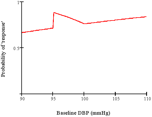
Serial data (aka longitudinal data) with multiple follow-up assessments per patient presents special challenges and opportunities. My preferred analysis strategy uses full likelihood or Bayesian continuous-time analysis, using generalized least squares or mixed effects models. This allows each patient to have different measurement times, analysis of the data using actual days since randomization instead of clinic visit number, and non-random dropouts as long as the missing data are missing at random. Missing at random here means that given the baseline variables and the previous follow-up measurements the current measurement is missing completely at random. Imputation is not needed. In the Hypertension July 2017 article Heterogeneity in Early Responses in ALLHAT (Antihypertensive and Lipid-Lowering Treatment to Prevent Heart Attack Trial) by Sanket Dhruva et al, the authors did advanced statistical analysis that is a level above the papers discussed elsewhere in this article. However, their claim of avoiding dichotomania is unfounded. The authors were primarily interested in the relationship between blood pressures measured at randomization, 1m, 3m, 6m with post-6m outcomes, and they correctly envisioned the analysis as a landmark analysis of patients who were event-free at 6m. They did a careful cluster analysis of blood pressure trajectories from 0-6m. But their chosen method assumes that the variety of trajectories falls into two simple homogeneous trajectory classes (immediate responders and all others). Trajectories of continuous measurements, like the continuous measurements themselves, rarely fall into discrete categories with shape and level homogeneity within the categories. The analyses would in my opinion have been better, and would have been simpler, had everything been considered on a continuum.
With landmark analysis we now have 4 baseline measurements: the new baseline (previously called the 6m blood pressure) and 3 historical measurements. One can use these as 4 covariates to predict time until clinical post-6m outcome using a standard time-to-event model such as the Cox proportional hazards model. In doing so, we are estimating the prognosis associated with every possible trajectory and we can solve for the trajectory that yields the best outcome. We can also do a formal statistical test for whether the trajectories can be summarized more simply than with a 4-dimensional construct, e.g., whether the final blood pressure contains all the prognostic information. Besides specifying the model with baseline covariates (in addition to other original baseline covariates), one also has the option of creating a tall and thin dataset with 4 records per patient (if correlations are accounted for, e.g., cluster sandwich or cluster bootstrap covariance estimates) and modeling outcome using updated covariates and possible interactions with time to allow for time-varying blood pressure effects.
A logistic regression trick described in my book Regression Modeling Strategies comes in handy for modeling how baseline characteristics such as sex, age, or randomized treatment relate to the trajectories. Here one predicts the baseline variable of interest using the four blood pressures. By studying the 4 regression coefficients one can see exactly how the trajectories differ between patients grouped by the baseline variable. This includes studying differences in trajectories by treatment with no dichotomization. For example, if there is a significant association (using a composite (chunk) test) between treatment and any of the 4 blood pressures and in the logistic model predicting treatment, that implies that the reverse is true: one or more of the blood pressures is associated with treatment. Suppose for example that a 4 d.f. test demonstrates some association, the 1 d.f. for the first blood pressure is very significant, and the 3 d.f. test for the last 3 blood pressures is not. This would be interpreted as the treatment having an early effect that wears off shortly thereafter. [For this particular study, with the first measurement being made pre-randomization, such a result would indicate failure of randomization and no blood-pressure response to treatment of any kind.] Were the 4 regression coefficients to be negative and in descending order, this would indicate a progressive reduction in blood pressure due to treatment.
Returning to the originally stated preferred analysis when blood pressure is the outcome of interest (and not time to clinical events), one can use generalized least squares to predict the longitudinal blood pressure trends from treatment. This will be more efficient and also allows one to adjust for baseline variables other than treatment. It would probably be best to make the original baseline blood pressure a baseline variable and to have 3 serial measurements in the longitudinal model. Time would usually be modeled continuously (e.g., using a restricted cubic spline function). But in the Dhruva article the measurements were made at a small number of discrete times, so time could be considered a categorical variable with 3 levels.
I have had misgivings for many years about the quality of statistical methods used by the Channing Lab at Harvard, as well as misgivings about the quality of nutritional epidemiology research in general. My misgivings were again confirmed in the 2017-07-13 NEJM publication Association of Changes in Diet Quality with Total and Cause-Specific Mortality by Mercedes Sotos-Prieto et al. There are the usual concerns about confounding and possible alternate explanations, which the authors did not fully deal with (and why did the authors not include an analysis that characterized which types of subjects tended to have changes in their dietary quality?). But this paper manages to combine dichotomania with probably improper change score analysis and hard-to-interpret results. It started off as a nicely conceptualized landmark analysis in which dietary quality scores were measured during both an 8-year and a 16-year period, and these scores were related to total and all-cause mortality following those landmark periods. But then things went seriously wrong. The authors computed change in diet scores from the start to the end of the qualification period, did not validate that these are proper change scores (see above for more about that), and engaged in percentiling as if the number of neighbors with worse diets than you is what predicts your mortality rather than the absolute quality of your own diet. They then grouped the changes into quintile groups without justification, and examined change quantile score group effects in Cox time-to-event models. It is telling that the baseline dietary scores varied greatly over the change quintiles. The authors emphasized the 20-percentile increase in each score when interpreting result. What does that mean? How is it related to absolute diet quality scores?
The high quality dataset available to the authors could have been used to answer real questions of interest using statistical analyses that did not have hidden assumptions. From their analyses we have no idea of how the subjects’ diet trajectories affected mortality, or indeed whether then change in diet quality was as important as the most recent diet quality for the subject, ignoring how the subject arrived at that point at the end of the qualification period. What would be an informative analysis? Start with the simpler one: used a smooth tensor spline interaction surface to estimate relative log hazard of mortality, and construct a 3-D plot with initial diet quality on the x-axis, final (landmark) diet quality on the y-axis, and relative log hazard on the z-axis. Then the more in-depth modeling analysis can be done in which one uses multiple measures of diet quality over time and relates the trajectory (its shape, average level, etc.) to hazard of death. Suppose that absolute diet quality was measured at four baseline points. These four variables could be related to outcome and one could solve for the trajectory that was associated with the lowest mortality. For a study that is almost wholly statistical, it is a shame that modern statistical methods appeared to not even be considered. And for heaven’s sake analyze the raw diet scales and do not percentile them.
Cluster Analysis
Emma Ahlqvist et al in Novel subgroups of adult-onset diabetes and their association with outcomes: a data-driven cluster analysis of six variables did a cluster analysis of glutamate decarboxylase antibodies, age at diagnosis, BMI, HbA1c, and homoeostatic model assessment 2 estimates of β-cell function and insulin resistance. They claimed to find five distinct clusters having varying levels of clinical outcomes associated with them. Such cluster analysis is in fact a statistically forced result that is caused by the clustering algorithms, and the resulting clusters are far less clinically relevant than it appears. To understand why, consider the following points. Start by envisioning the clusters as non-overlapping regions such as rectangles, ellipses, or circles.
- There is no clinical reason why the clusters should not overlap.
- If the clusters do not overlap, imagine two non-overlapping large regions sharing a border. Consider a patient at the outer part of one cluster region and a patient in the other cluster who is close to the first patient. Though these patients are assigned to different clusters, they may very well be more like each other in every way than they are like patients at the center of their own clusters.
- Patients within a cluster are far from homogeneous.
Cluster analysis on 6 continuous variables is unlikely to be as useful as flexible continuous regression models using the 6 variables to predict a diagnosis or an outcome. If the clusters are in fact clinically useful, one should not assign a patient to a cluster and call it a done deal. The proper way to take into account close calls, distance, and within-cluster patient heterogeneity is to compute the distance each patient is from each cluster center. If there are in fact five clusters (which is highly debatable), each patient would need to be summarized by 5 continuous distances from cluster centers, and the meaning of each cluster would have to be carefully thought through.
When clustering is based on a relatively small number of measurements (here, 6) clustering does not result in enough dimensionality reduction (5 distances from cluster centers) to be of much value. And one could just fit additive spline models on the 6 raw measurements to predict an outcome of interest. This directly aims at explaining outcome heterogeneity and would be far more useful. Multivariable regression will also inform the clinician of which continuous predictors are explaining the bulk of the variation in outcomes. One or two of the six predictors used in clustering may not even be relevant once the other predictors are adjusted for.
If distances are erroneously ignored (as done in the paper at issue), the authors set themselves up for later researchers to find subtypes within each of their clusters.
The cluster analysis by Ahlqvist actually represents a demonstration that adult-onset diabetes should never have been considered an all-or-nothing condition. The clusters are just making up for past mistakes. This is discussed more eloquently by Vickers, Basch, and Kattan in Against Diagnosis.
A simple way to demonstrate the futility of placing patients into discrete clusters and pretending they are homogeneous (i.e., ignoring distance from cluster centers) is to estimate the strength of the relationship between HbA1c and a clinical outcome, within a cluster having the greatest dispersion of HbA1c (as measured by Gini’s mean difference for HbA1c or by the standard deviation of the reciprocal of HbA1c).
Further Reading
- Biostatistics for Biomedical Research
- Richard Lehman’s journal reviews